I've been pretty inspired lately with the way things have been going for our group. I didn't realize how much I had come to dislike my work situation until I got out from under it. It's pretty amazing to think I could lose appreciation for doing art for a living, but my days were distorted into a really negative grind for me.
Now that I've got some really positive things going and feel inspired being around my "virtual bullpen buddies" again it's "Onward and Upward" from here! (thanks B.T.!)
Here are a couple of samples I've done recently. I did the "Pony Girl" first and so, I guess I needed to counter it's decidedly "saccharin" sunniness with a little urban grit I called "Street Call". Hope you like em. Check us out at www.PitchHouse.net !
Friday, October 29
Saturday, September 4
Welcome to Pitch House
The first three rules about Pitch House are... "you talk about Pitch House". Ok, it's a cheap knock off from Fight Club, but I'm just that cheesy. Well, as things evolve in life I find myself banding together with my best illustrating friends in this world to form Pitch House. We've been working together for the better part of 25 years in and around NYC's most dynamic advertising illustration studios.
Geographic proximity having less importance than ever these days, our online studio with it's Project Management, Client Area &Administration will provide even more efficient service to our clients from our locations around the country.
The Pitch House consists of Tom Fluharty, Kevin Sacco, Ray Ketchem, Tim Shinn and myself, John R Wohland. Please check us out at PitchHouse.net
Here's a little montage sample I did to celebrate:
So I guess I'm John R Wohland DBA Get Your Sketch at Pitch House.. "Whatever it Takes" right? Bring it on!
Geographic proximity having less importance than ever these days, our online studio with it's Project Management, Client Area &Administration will provide even more efficient service to our clients from our locations around the country.
The Pitch House consists of Tom Fluharty, Kevin Sacco, Ray Ketchem, Tim Shinn and myself, John R Wohland. Please check us out at PitchHouse.net
Here's a little montage sample I did to celebrate:
So I guess I'm John R Wohland DBA Get Your Sketch at Pitch House.. "Whatever it Takes" right? Bring it on!
Monday, June 21
Cowgirls
Just a Little Sketch
I like to do some gesture sketches when I have some time. Here's one that I felt like taking a little farther and thought was worth sharing :)
Wednesday, June 16
Harry Shearer for fb
I've been enjoying the competitions on facebook the last couple of weeks at Caricaturama 3000 . Here's my entry this week
Saturday, May 29
Bug Ladies
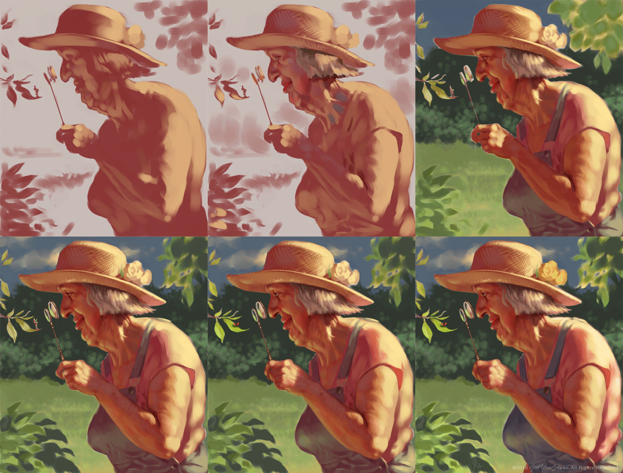
Hi, This one was Big Fun! Even the dearest little old lady can be quite frightening when the light hits just right. Oh my
Hope you like it! A few things "clicked in" for me on this one :)
Here's the steps.. watch the little leaf figure turn from a cheeky elfin tinkerbellish bug to a ladybug. It was too weird even for me :)
Here's the reference. Obviously I had a good start on this one. It helps a lot
Hope you like it! A few things "clicked in" for me on this one :)
Here's the steps.. watch the little leaf figure turn from a cheeky elfin tinkerbellish bug to a ladybug. It was too weird even for me :)
Here's the reference. Obviously I had a good start on this one. It helps a lot
Monday, May 24
Directing Eye Traffic
Just some gesture sketches in Painter that turned into a little picture somehow. ( I decided to post a slightly less "worked" version as the final. This is a sketch after all. I kept gravitating toward version 6 over the posted version 9. I may not know when to stop, but here's to digital iterations!)
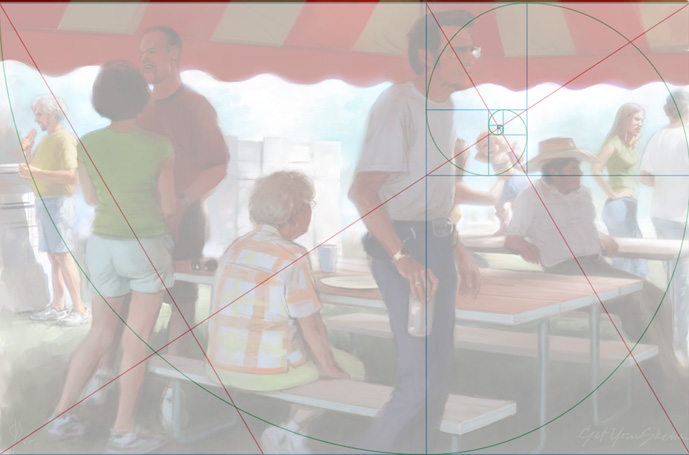
I thought it would be fun to experiment with the "divine proportion" grid trying to wrestle this chaos into some order. I really have only relied on instincts compositionally ( I once had a Design teacher tell me I was the closest in the class to being a "natural designer". Oh well, close but not quite. I guess I'll take it). Anyway, I'd love to keep studying more composition theory. Any experts on the subject out there? I'd love to kick the theories around a little. Here's to never "knowing it all".
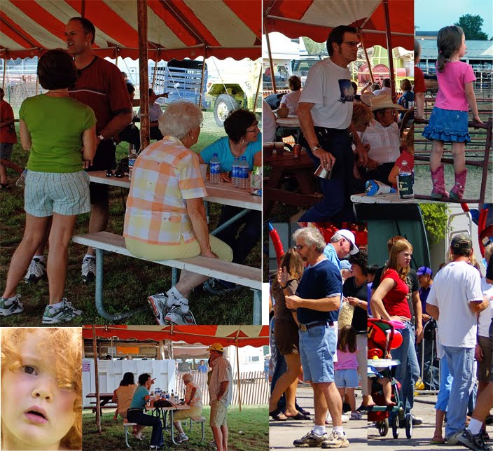
Here's the reference for anyone interested:
I thought it would be fun to experiment with the "divine proportion" grid trying to wrestle this chaos into some order. I really have only relied on instincts compositionally ( I once had a Design teacher tell me I was the closest in the class to being a "natural designer". Oh well, close but not quite. I guess I'll take it). Anyway, I'd love to keep studying more composition theory. Any experts on the subject out there? I'd love to kick the theories around a little. Here's to never "knowing it all".
Here's the reference for anyone interested:
Saturday, May 15
Dark & Gritty Tutorial & What Came Out of it
Hi!
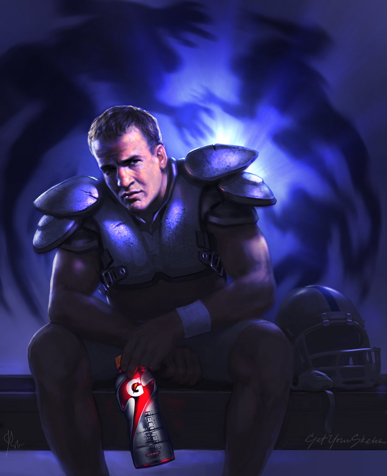
I've been pretty busy lately with storyboard/comp advertising work so this latest promotional piece was done in a few sessions over the last week or so. It's a bit of a Darker, Grittier direction for me. I owe some of this new experimentation to a great tutorial I soaked up this week from the Massive Black collection. Brad Rigney's "Hostile Takeover" tutorial is, unfortunately, not online anymore.
As well as being a phenomenal self taught artist and a self described "hack" at the same time, he was entertaining and insightful for 5 hours straight. The art he produced in the tutorial took him in the neighborhood of 100 hours, which to me, coming from a sketch art background, seems a bit staggering. The results are amazing and his techniques are unconventional to say the least. Anyway, it's well worth checking out. I'll likely try some others from Massive Black soon. I can't wait to see what it stirs up in me next time.
Anytime I'm inspired to try my hand at something, I inevitably come at it from the angles I know best, mainly advertising art.
I'd say the main takeaways from this tutorial which I tried to apply in my piece was the use of large textured brushes to create some dark noise from which to begin pulling light features out of. Brad uses the Dodge tool extensively which, to me, was worth the price of admission. I always considered the Dodge tool to be a photographic editing tool. But what it does differently than a brush in Color Dodge mode is that it brightens the pixels more selectively, leaving the darkest pixels under the tool to be effected a little less than brighter ones. The effect can build highlights pretty quickly using the colors which have already been established in the dark underpainting. Brad also uses the smudge tool artistically alternating between smearing areas to create "micro gradients" and pushing small areas to "tighten" them. I tried to use the Smudge tool in places on my project and found it useful for me for moving groups of pixels where I was happy with the values, but the placement needed tweaking (mostly when trying to achieve the likeness comparing it to my photo). Brad uses Smudge much more extensively than I managed to. It felt a little foreign using it that way. But it's fun to play with.
I thought I'd post the reference also, for anyone interested
I enjoyed working in such a dark register (much easier to do in the dark of the night). It was fun applying some of the techniques I learned while they were still fresh, and of course I felt compelled to put the image to "work", hence the Gatorade. You can teach an old dog some new tricks, but he still knows what he knows I guess :)
I'd love to hear any comments or critiques.. the more eyeballs the better!
I've been pretty busy lately with storyboard/comp advertising work so this latest promotional piece was done in a few sessions over the last week or so. It's a bit of a Darker, Grittier direction for me. I owe some of this new experimentation to a great tutorial I soaked up this week from the Massive Black collection. Brad Rigney's "Hostile Takeover" tutorial is, unfortunately, not online anymore.
As well as being a phenomenal self taught artist and a self described "hack" at the same time, he was entertaining and insightful for 5 hours straight. The art he produced in the tutorial took him in the neighborhood of 100 hours, which to me, coming from a sketch art background, seems a bit staggering. The results are amazing and his techniques are unconventional to say the least. Anyway, it's well worth checking out. I'll likely try some others from Massive Black soon. I can't wait to see what it stirs up in me next time.
Anytime I'm inspired to try my hand at something, I inevitably come at it from the angles I know best, mainly advertising art.
I'd say the main takeaways from this tutorial which I tried to apply in my piece was the use of large textured brushes to create some dark noise from which to begin pulling light features out of. Brad uses the Dodge tool extensively which, to me, was worth the price of admission. I always considered the Dodge tool to be a photographic editing tool. But what it does differently than a brush in Color Dodge mode is that it brightens the pixels more selectively, leaving the darkest pixels under the tool to be effected a little less than brighter ones. The effect can build highlights pretty quickly using the colors which have already been established in the dark underpainting. Brad also uses the smudge tool artistically alternating between smearing areas to create "micro gradients" and pushing small areas to "tighten" them. I tried to use the Smudge tool in places on my project and found it useful for me for moving groups of pixels where I was happy with the values, but the placement needed tweaking (mostly when trying to achieve the likeness comparing it to my photo). Brad uses Smudge much more extensively than I managed to. It felt a little foreign using it that way. But it's fun to play with.
I thought I'd post the reference also, for anyone interested
I enjoyed working in such a dark register (much easier to do in the dark of the night). It was fun applying some of the techniques I learned while they were still fresh, and of course I felt compelled to put the image to "work", hence the Gatorade. You can teach an old dog some new tricks, but he still knows what he knows I guess :)
I'd love to hear any comments or critiques.. the more eyeballs the better!
Subscribe to:
Posts (Atom)