Saturday, May 29

Bug Ladies

Hi, This one was Big Fun! Even the dearest little old lady can be quite frightening when the light hits just right. Oh my
Hope you like it! A few things "clicked in" for me on this one :)
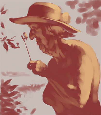
Here's the steps.. watch the little leaf figure turn from a cheeky elfin tinkerbellish bug to a ladybug. It was too weird even for me :)
Here's the reference. Obviously I had a good start on this one. It helps a lot

Monday, May 24

Directing Eye Traffic

Just some gesture sketches in Painter that turned into a little picture somehow. ( I decided to post a slightly less "worked" version as the final. This is a sketch after all. I kept gravitating toward version 6 over the posted version 9.  I may not know when to stop, but here's to digital iterations!)

I thought it would be fun to experiment with the "divine proportion" grid trying to wrestle this chaos into some order. I really have only relied on instincts compositionally ( I once had a Design teacher tell me I was the closest in the class to being a "natural designer". Oh well, close but not quite. I guess I'll take it). Anyway, I'd love to keep studying more composition theory.  Any experts on the subject out there?  I'd love to kick the theories around a little.  Here's to never "knowing it all".
Here's the reference for anyone interested:

Saturday, May 15

Dark & Gritty Tutorial & What Came Out of it

Hi!
    I've been pretty busy lately with storyboard/comp advertising work so this latest promotional piece was done in a few sessions over the last week or so. It's a bit of a Darker, Grittier direction for me. I owe some of this new experimentation to a great tutorial I soaked up this week from the Massive Black collection. Brad Rigney's "Hostile Takeover" tutorial is, unfortunately, not online anymore.

As well as being a phenomenal self taught artist and a self described "hack" at the same time, he was entertaining and insightful for 5 hours straight. The art he produced in the tutorial took him in the neighborhood of 100 hours, which to me, coming from a sketch art background, seems a bit staggering. The results are amazing and his techniques are unconventional to say the least. Anyway, it's well worth checking out. I'll likely try some others from Massive Black soon. I can't wait to see what it stirs up in me next time.
    Anytime I'm inspired to try my hand at something, I inevitably come at it from the angles I know best, mainly advertising art.
I'd say the main takeaways from this tutorial which I tried to apply in my piece was the use of large textured brushes to create some dark noise from which to begin pulling light features out of. Brad uses the Dodge tool extensively which, to me, was worth the price of admission. I always considered the Dodge tool to be a photographic editing tool. But what it does differently than a brush in Color Dodge mode is that it brightens the pixels more selectively, leaving the darkest pixels under the tool to be effected a little less than brighter ones. The effect can build highlights pretty quickly using the colors which have already been established in the dark underpainting. Brad also uses the smudge tool artistically alternating between smearing areas to create "micro gradients" and pushing small areas to "tighten" them. I tried to use the Smudge tool in places on my project and found it useful for me for moving groups of pixels where I was happy with the values, but the placement needed tweaking (mostly when trying to achieve the likeness comparing it to my photo). Brad uses Smudge much more extensively than I managed to. It felt a little foreign using it that way. But it's fun to play with.

I thought I'd post the reference also, for anyone interested
I enjoyed working in such a dark register (much easier to do in the dark of the night). It was fun applying some of the techniques I learned while they were still fresh, and of course I felt compelled to put the image to "work", hence the Gatorade. You can teach an old dog some new tricks, but he still knows what he knows I guess :)

I'd love to hear any comments or critiques.. the more eyeballs the better!


Saturday, May 8

TABASCO baby dragon creation demo

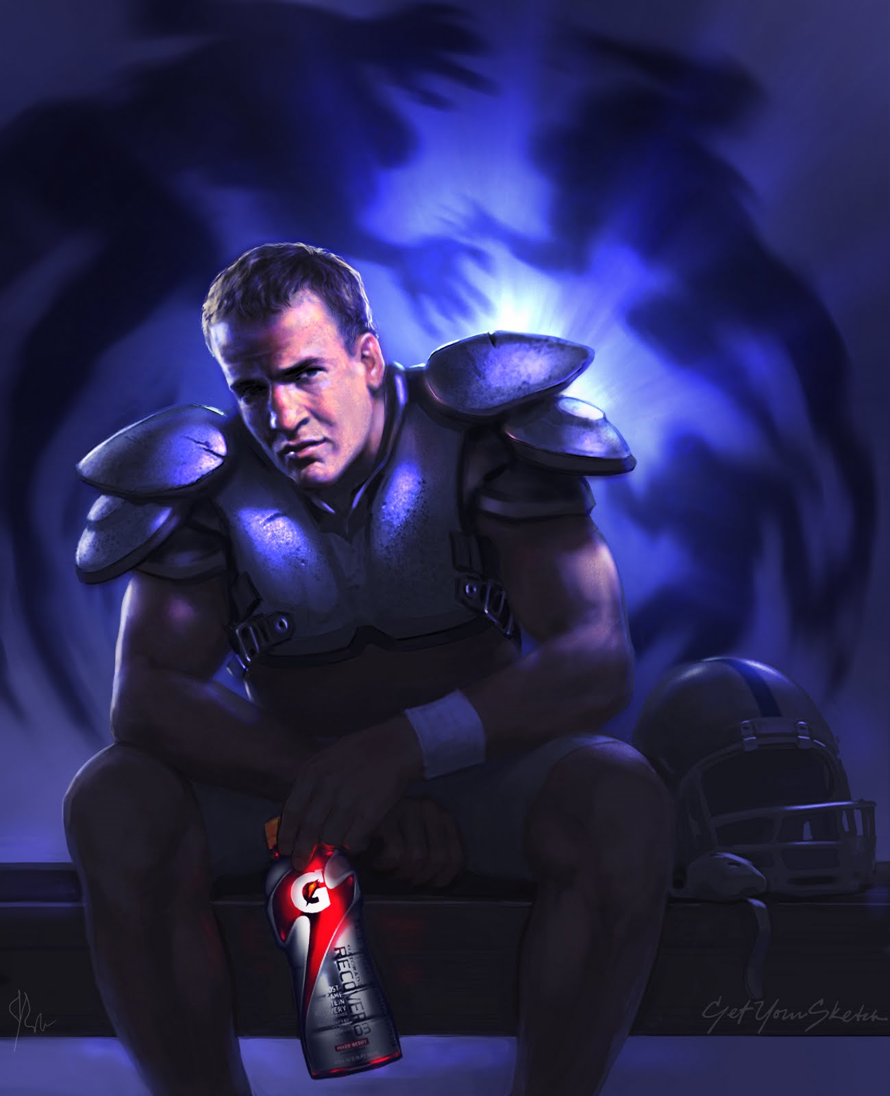
   Hello! Welcome to my first artwork post here! I thought I'd post the development of the TABASCO® baby dragon promotional piece for anyone interested. Thanks to all the positive responses to this piece on facebook and elsewhere including the reposts (with credits, of course:P)
  
  The initial thought I had was to mix some of the lure the fantasy art I've been inspired by lately at CGSociety with my roots in advertising art. I'd always rather tell a story with my pictures rather than make a picture without a specific purpose in mind. Art for art's sake has it's place for sure,but I'm hardwired by now to try for commerical viability, even in a sample piece.
Speaking of that, buy a print or gift here: HERE!

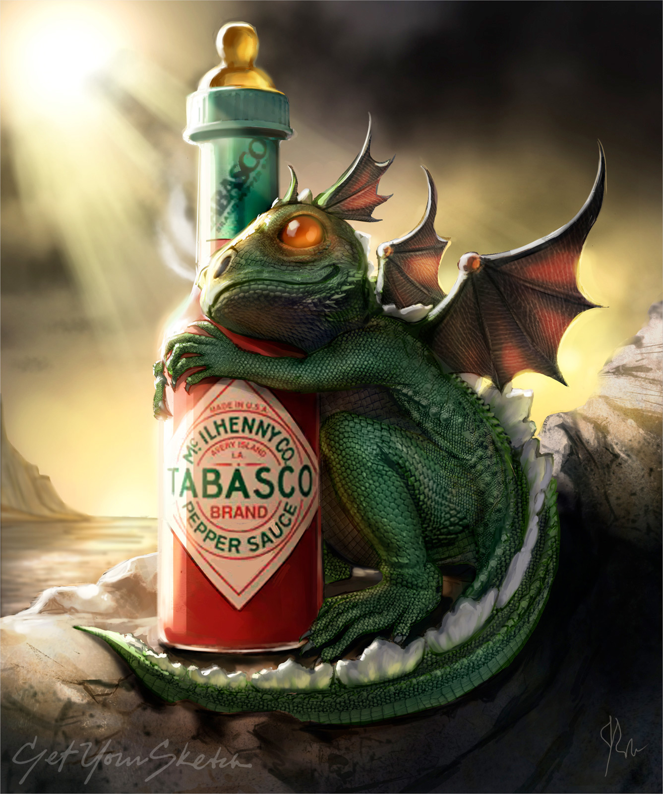
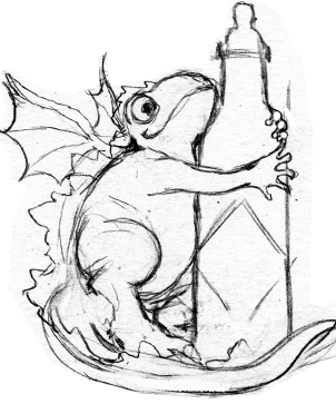
   So here's the first pre-reference thumbnail sketch I did. It's pretty uninformed, but it's an idea "hatched" so to speak. As you can see, the first sketch was flopped.
   I'm including a couple more iterations of the rough sketch along the way in case its interesting to see its evolution. As is sometimes the case, there are things looking back that I wish I would have kept in the final design, but live and learn.
   I got a little more reference in front of me. gathering up lizards and dragons. While I kind of liked the feeling of the "gooey frog hands" on the bottle from a tactile point of view, I thought it would take away from the realism of the piece in the end. And since baby dragons are real, this is really important :P

    I was still struggling a bit with the angle of the head here. this sketch is pretty cartoony, but there's something about the contact and intimacy between the dragon and the bottle that I miss now, honestly.
    I tried to get the head positioned in a way that I thought was more possible for a dragon/lizard and moved more towards the boney looking hands of our real lizard friends.
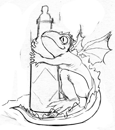
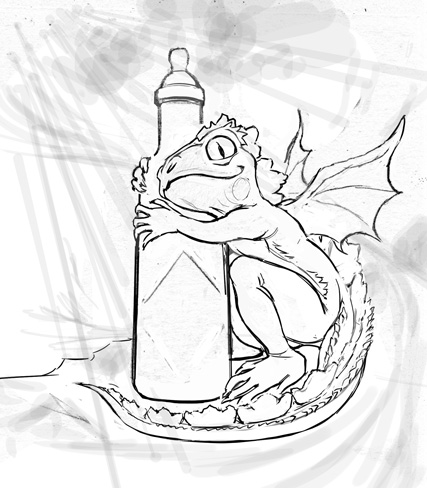
      This version has some pretty substantial "fins" all the way up to the head, which I later toned down for the sake of the little ears which I liked to pick up the wing material. It's my world right? I decided against the pupils at this point also because they just looked goofy to me.
   I've started to develop the light direction at this point, which is the primary reason I flopped the piece. I wanted the light to lead into the picture
   So here's the line drawing over the beginnings of my underpainting. I like to paint into a mid-tone grey with a relevant tint depending on the subject matter. I paint with white mostly, unless there's an obvious color light source if I just don't want to fight the grey as much later in the process. in this case I couldn't resist "screening" out the pink translucency in the wings and ears as well as the sub-surface light in the tail fins
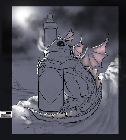
The critical stage of the scales is accomplished by assembling/and or cloning photo assets to combine with the basic form rendering using a combination of Multiply and Luminosity mode overlays (see gif below)

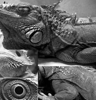
    Continuing with the under-painting, I've decided to enhance the red reflective light that the bottle might throw since it's the star of the show. The effect is subtle in the final, but it's part of the mix.
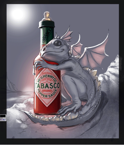
 Here's the build stages starting with

•BaseColor •Underpainting •Combined •Finishing Effects

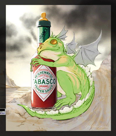
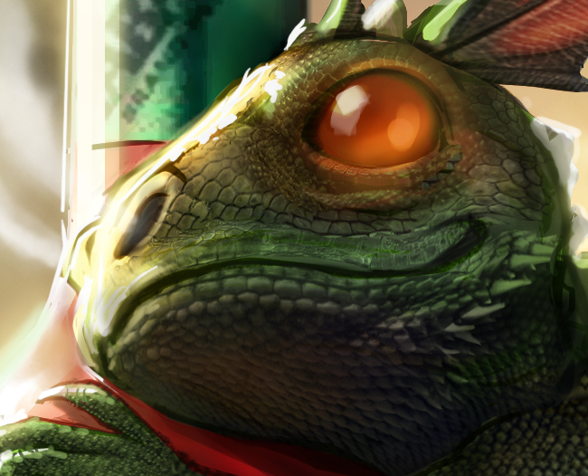
Here's a detail
shot of the head.
That's it! I hope you found this demo useful, enjoyable, interesting or some combination of those. I always enjoy seeing how the other half works, and I hope you do also. I figure we all make each other better artists that way.
Till the next time!
John :)

So, I've used this little guy as my inspiration recently to go ahead and explore some gaming tools and learn the pipeline on my personal time. 

It's been a great experience, and while I'm sure it makes sense to divide all these tasks across a team of people who can do these things more proficiently, learning what others need to do in the pipeline always informs whatever part of the job you choose to specialize in. Here is the project, if you're interested.

 Thanks again for following! Project Link:

Thursday, May 6

First Post: A Little About Me

Hi,
     A little about myself might be in order. My name is John Robert Wohland. I grew up in Bayside Queens NYC on huge block of garden apartments. It was a rich environment for a creative kid with plenty of playmates on hand. This said, I'd often rather stay indoors making something, be it a drawing or a model of something. I always loved drawing and painting but my only impression of how to get paid for it was from seeing the poor artists with their paintings propped up on the curb of the bank parking lot. It never seemed like an option until I stumbled upon B.O.C.E.S vocational school in H.S. Their Advertising Art program took up just enough of my spare time to keep me out of trouble since I had just moved out to Long Island and was a bit "displaced". There was no looking back as soon as I had an idea I could make a living doing something I truly loved to do.

    I went on to two years at SUNY Farmingdale, got an AS in Applied Science? Yup... Well, I would have went for a couple of years at SVA, but my professors suggested I go right to work, and that I'd learn more. So, after my first interviews (girlfriend's Father was an Art Director at N.W.Ayer by TOTAL coincidence), I redid my entire porftolio over the course of a month because no one mentioned there was such a thing called "storyboards"in college. I was 19 years old

     Well, my first interview was at GEM studio, but I wasn't ready. I got a job at Agency Art Associates which was a very nurturing environment. I was able to make my mistakes, but find my way. I was fortunate to work side by side with wily veterans like Bob Tremaine and Tony Grimando. I was also just a door down from Eric Watts, who turned out to be a huge inspiration for me.

    I worked there for 3 years and got at least a little bit of an identity on my own. Enough, so that I was able to land the job I really wanted at GEM, with a little more experience under my belt. I knew it was brutal in some ways, but it was the place to be and learn. Well I worked at GEM for 16 years along side some of the greatest artists and people in our business learning and growing everyday. We figure with the hours we worked, that's about 32 in "people years".

   It seemed like high time to commit some of my story and my work to the blogosphere.
Thanks for looking,
John

Artwork post to follow soon!

Saturday, May 1

Hey, Looking forward to starting my blog...

Nothing to see yet! Thanks to Tom Fluharty for the suggestion to start a blog for the sake of working things out in the open. More to come!